

The CSS border-image property is one of those CSS features that seems complex at first glance but offers incredible creative possibilities once understood. It allows designers to use images as borders instead of solid colors, opening up a world of decorative options for buttons, cards, sections, and more.
Understanding the Syntax
The border-image property is actually a shorthand for several related properties:
border-image-source- Specifies the image to useborder-image-slice- How to slice the imageborder-image-width- Width of the border imageborder-image-outset- How far the border extends beyond the boxborder-image-repeat- How the image should be repeated
Basic Example
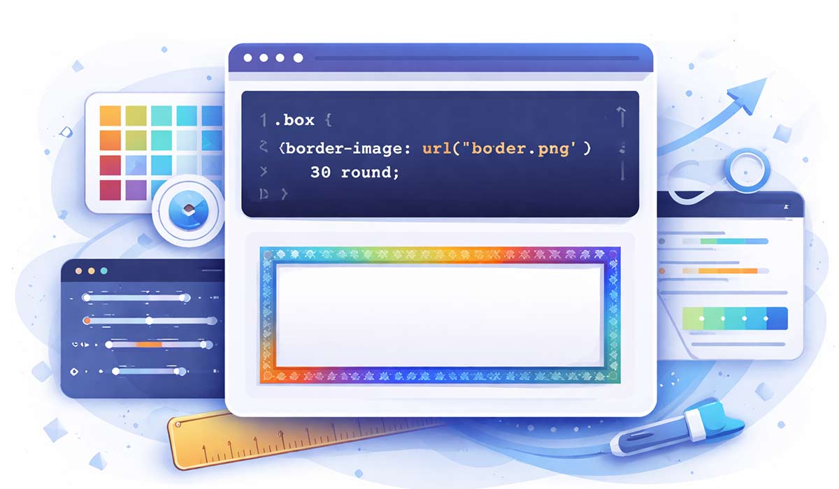
Here's a simple example to get started:
.bordered-box {
    border: 20px solid transparent;
    border-image: url('border.png') 30 round;
}
How Slicing Works
The slice value divides your image into a 3x3 grid. The corners remain unchanged while the edges are stretched or repeated to fill the border area. Think of it like creating nine-slice scaling in graphics software.
- Single value: Applied to all edges equally
- Two values: First for top/bottom, second for left/right
- Four values: Top, right, bottom, left (like other CSS properties)
The Repeat Property
The border-image-repeat property controls how the border sections fill the space:
stretch- Default; stretches the image to fillrepeat- Tiles the image without scalinground- Tiles and scales to fit evenlyspace- Tiles with even spacing between
Practical Use Cases
CSS border images shine in several scenarios:
- Decorative Buttons: Create unique, graphical button states without extra HTML elements
- Photo Frames: Add ornate frames to images without additional markup
- Card Designs: Create cards with interesting edge treatments
- Callout Boxes: Design attention-grabbing content boxes
Browser Support
The good news is that border-image has excellent browser support. All modern browsers support it, and fallbacks are simple since borders without images will just display as specified regular borders.
Tips for Best Results
- Use SVG images for crisp, scalable borders
- Test your slice values carefully - they can be tricky to get right
- Remember to set
border-styleto a value other than 'none' - Combine with
box-shadowfor enhanced effects - Consider using generators if you're new to creating border images
Key Takeaway: The CSS border-image property may seem intimidating at first, but it's a powerful tool for creating unique, visually appealing designs. By understanding how slicing, repeating, and the various related properties work together, you can create borders that would be difficult or impossible to achieve with traditional CSS borders. Start with simple examples and gradually experiment with more complex patterns as you become comfortable with the syntax.